Tuesday, June 30, 2015

UX Design Process Guide in Limited Period of Time - 01

We always try to do UX design step by step for every project. We want to be tested from each step, but sometimes your project timelines are not allowed you to do that. Client, Product owners or stakeholders are always in hurry. They want to finish their product as quickly as possible and launch in the market. As UX designers we care about users before the launch of the product.

Durring the year I wan working on few projects which have very limited timelines and need to launch. I learned many things from each project and adds those to next project.

In this post I am going to share with you, few steps which will helps you to make you UX project faster with short period of time.

Lean UX


In 2012 I read this book Lean UX by Jeff Gothelf. I found few tricks which we can use to bring the outcome of product (not output). I also implement this model in my few projects and I got a successful positive feedback for my projects. This method helps you to get more deeper customer insights and business goals of the product.

"The Design Sprint" by Google Ventures 

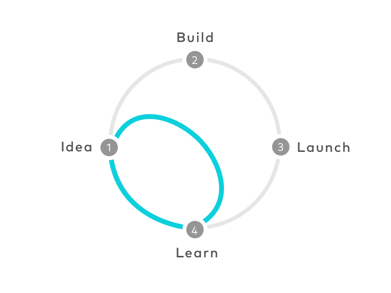
Design Sprint by Google Ventures


Google Ventures introduced their design sprint methodology in the middle of 2013. They introduced 5 Day process for answering critical business questions through design, prototyping, and testing ideas with customers. I studied this method and try to implement in my UX projects. Sometimes I got positive feedback from customers, but sometimes they didn't give me any feedback.

Sometimes we read many books, articles, process and methods. We always try to implement them in our project to make them WOW! We always want to give that WOW experience to users and our project managers, stakeholders, product owners, etc. But due to timeline we got in our projects sometimes we didn't reach to that level. So what we have to do? From where we should take actions? Which point will make us to stop and test?

1. Declare Assumptions & Create Hypothesis


When you get the project, 1st thing to do with all your team members is declare your all assumptions from user's and business side. This can be based on your analysis or your past experience with same project, your product owners might knows something about the domain, client's past experience. You also use the method "How Might we". This will helps you create a very clear vision of your project. What exactly you are making for who. Once you done with your all assumptions you create your hypothesis statements and share it with your client. If possible you can involve your client to make assumptions. It is good to have all members of the project will be there. But I know sometimes it is not possible, so you can do with your BAs. 

How to ?

  • Create Questionnaire for assumptions
  • Send them by emails or google forms to all team members
  • Collect Data and create hypothesis based on all assumptions
  • Figure out features & elements of the product
  • Give some rankings or ratings to the features or elements. This helps to prioritize the features
  • Share all this in Google drive so everyone can see and comment

Duration for this 1 or 2 Day


2. Create User Personas, User Stories and User Flow or Journey Map


After getting all the information on the product move to get more insights about the user. Create list of things which you want to know about user. Try to interview live personas. If personal interview is not possible then call your friends, ask them list of questions on the phone. Real personas are really matters, just try once for your project you will get very different insight from them. UX design is gone to the level to make desirable products. We are capable of making usable products but now user wants more. To know that more, you need to talk with user. 


How to?

  • Make list of questions to ask 
  • Call friends or meet them (based on type of user choose how many personas)
  • Write down on paper
  • Upload photograph of that on your google drive folder
  • Get feedback and discuss with team

Once you got the user personas make stories of those personas. It is some kind of screenplay of your project. How your user are interacting with your product. Write it down all user stories. Mention each detail in user story. For example, User come to hotel, he seat on table and then take his mobile out from his pocket. He unlocks it... It helps you to understand every detail interaction of the user. Where he is, location, data connection on that location, etc.


How to?

  • Based on the assumptions and hypothesis, make your user stories
  • User stories should achieve business goal 
  • Mentioned each detail
  • Find out interactions of user
  • Document them and share with team members
  • Get feedback and discuss with team

After user stories, take your important user story and start making user flow. Draw this flow on your whiteboards. Think about the interactions based on the user story. It helps you to find out the tasks of the user. Try to make the task more easier, try to find out easiest way to achieve that task. Try to find out the emotions behind that task.Map a wonderful user journey to make user more desirable.

How to?

  • Draw flows on whiteboard
  • Use Sticky posts for interactions, so you can move them easily.
  • Get a picture of that before clearing the whiteboards
  • Share final picture on Google Drive
  • Get feedback and discuss with team
Once you done with user flow you will ready with the no. of screens you want to make. Where are user making the interactions. What you want to design and what not.

After this we will have making story boards and wireframes, then also make those wireframes presentable and getting valuable feedback from the client. Sometimes client is not familiar with wireframe stage. We will see these points in the next post.

If you want to ask me any questions regarding this process please mention in comments.

ADDITIONAL RESOURCES


Thursday, August 21, 2014

Bollywood Movies and their Mobile Games

When you search for keyword 'Bollywood' in App Store or Play Store you will find many thousands of apps. Very few of them are worth. I only kept Bookmyshow app which is related to Bollywood and its not only worth but a great app which delivers good UX (user experience). 


While working in UX industry we have habbit to check UX of other app/website or any services. In India, Bollywood is like religion. Some movies are good, some of them are unbearable. Let's have look on some of the Bollywood movies app, Are they deliver experience as their movies do?


 1. RaOne

I think this is one of the first Game which refers from a Bollywood film (I'm not sure!). This Game is launched by Red Chillies Entertainments Pvt .Ltd and Developed by Indiagames Ltd. in 2011. Its available only for App Store.

Game was developed with very good graphics and visual effects as we seen in the movie.Characters are nicely created as the Actors of the film. Gaming controls are also handy and easy to play or use. But at user engagement part is done poorly. If you check the reviews you will find that game crashes complaints. No Gamification values added in this game.

Overall its nice game, but you cant play as regularly. As movie goes by time you uninstall the app.


2. Race 2

Launched in Jan 2013, Developed by Gameshastra.Do you remember our old games, where we use coins to play the games. This game will give you same experience. Graphics, Characters, UI, etc. looks like the old time games.

In old days, to play the game we need to start computer or to set PS on TV. So whether a game is bad we played for passing the time. Nowdays while we have games on mobile we play in trains, buses, anywhere. In this case user can add or remove your game very easily.

While designing these games, Game Designers should think about UX and USability of the Games. Also they should add some Emotional Design to the game. As Compare to movie This game should have more User Engagement and Fun which allow user to play regularly. Gamification helps you to do this stuff.

3. Chennai Express

After two years August 2013, Shahrukh Khan and Indiagames Ltd. launched another game for their movie Chennai Express. Game is not free for iOS users.They taken inspiration of UI and some User Engagement tricks from very famous game Subway Surfers. Indiatime games always deliver good graphics and character animations in their games which is also influence for users to play the game.

Subway Surfers is one of the top game which use Gamification very nicely to engage user continuously. Indian game designers should study few Gamification tricks or hire some people from the industry. Movie come and go, but Game can earn money as more as you add user engagement with every new version. Releasing another version is not as much costly as releasing another movie in India.

4. Bhaag Milkha Bhaag

This is one of the best movie in 2013, which get maximum awards for the year. 

Game launched in August 2013, Developed by VIACOM 18 MEDIA PRIVATE LIMITED. As per the movie they designed the game UI very nicely. It's not out of the movie but related to the story as we seen in the movie. Game also have some user engagement values which get users to play this game more and cross the levels.

User mostly boost to play the game due to Leader boards, and if that board reflects your social status then user play more and more. Candy Crush, Subway Surfers are examples how we try to get the level and our friends level. These points should be added to gain high level of user engagement.


5. Dhoom 3

Sometimes you watch the trailer of the movie, you like it and then you go for the movie(In theater or torrent!). If movie is not good as trailer, you get disappointed. Same here we feel when we watch game promo and then download the game.

Game is launched in Dec 2013, developed by 99Games Online Pvt. Ltd. They worked on trailer of the video very hardly but not on the game. As I mentioned above, your Game graphics are most influence part for the users to access the game. Apart from graphics they game is nicely designed with story, but somehow it make us to remember Road Rash.

6. Kick

Another game Developed by Indiagames Ltd., launched in July 2014. Kick is blockbuster movie of 2014. As I said before Indiagames designed graphics very nicely. 

This game have some storyline as similar to the movie. User engagement is good as compared to other games. Still few elements are missing, as we are now in stage of developing gaming industry in India. User controls are poorly designed. As you can see in the above image, one square and typo break, it should be some Break icon, which understands user this is the break.

7. Singham Returns

Singham Returns is sequel of blockbuster movie Singham. They have launched two different games for Android and iOS. Above screenshot is from iOS.

For iOS game is developed by Roosh Interactive and Launched in August 2014. Game is designed very well, it use the all features which iOS can give to make more user engagement for you app and game. You can challenge to another user which is from you location. They also added Social media to connect and boost more users to play the game.


Another game is developed by Reliance (UK) and Launched in August 2014. As compare to other games developed by the same company, this game give you less graphics and sound effects.


You can see the graphics used in Game. Very less use of User engagement, gaming controls are poorly designed. Not influence user to play game more.

Gamification and User Engagement

When you are working in game development, you need to find out the triggers for engagement of users. Sending Notifications on mobile, Invites user or friends, Asking for Life to friends through Social media, these are few triggers which you can use to get more user engagement.

Define Audience

We look at the Top games which are from Bollywood top movies. Mostly they look like design for teen age users. Teenage prefer to play games on PS, with high level of grpahics when they are at home. Some of them are play on mobile too, when they are in train or in bus. I have seen many mid age people play games regularly in trains. So think about the target audience, study them, research them.


Please give me your comments and feedback.


Tuesday, October 15, 2013

UX Review of Online Shopping Websites in India

Product + Presentation is the key in today's world. One cannot survive without the other. presentation would include every aspect from location to the sales executive to the window display, it has also become an integral part of the product itself. 

This in the true sense is a ERA of design.

The eCommerce industry in India has been growing at an astounding rate of 128%, with more than 8 mn users shopping online every year. This growing interest has drawn a lot of attention from global investors.

India is country where festival come once in a month, lots of cultures, religious, etc. For each festival people buy new clothes, gold, jewelry, car, etc. Shopping sites offer promotions & niche products based on the festivals. No matter what country you are in, you always love discounts when you shop, so here also the same.

I will discuss about Indian Shopping Websites and their User Experience Design & Usability. I will also share some my experiences in online shopping. First we will discuss about the UX elements which needs to be added in eCommerce website. Elements which balance your website or product.

Elements of UX for eCommerce

There are four elements which need to balance in every eCommerce website or app. Value, Desirability, Adaptability & Usability. All these elements are equally important.

Usability

It's depend on how easy to complete task. eCommerce site or app should be usable and useful to the user. User should be able to search any product which he want, user should fill the checkout forms very easily, and also perform all other tasks very easily. Shopping portals should be easy to use, easy to shop.

Value

It refers to providing value to user. It also helps you to make more business on your website or app.
Sometimes product have good usability but doesn't get success in market. It's an alignment between product features and user needs. It is also depends on your business strategy.

Adaptability

Its a critical element in eCommerce. It relates users to buying and start using a product. Very closely related to Usability. If users found value in product, but they face some difficulties while using the product, then they will stop using that.

Desirability

Is your shopping portal gives fun or engaging experience to user, which other portals don't do. This element connect to emotional appeal of the user. Sometimes user enjoy using the product with it poor usability, when it has desirability. When that product gives him fun and engaging experience to the user.

So these are the UX elements which equally important and should be used in eCommerce website or app. These elements not only helps to engage users also help to make users or customers happy.

Let's check out, top shopping websites in India and their User Experience and Usability.

Flipkart.com

Launched in 2007, by Sachin Bansal who had been working for amazon.com. In initial years the focused on selling books, later on they expanded. with other products. This is a website who help majorly to increase online shopping in India. 


Usability of this site is good as feel easy to complete tasks. Accessible Search, Filtering products as per user need, Quick View of products these are some nice elements in website. Very good thing about this website is, it doesn't disturb you with Google ads. Images and Banners are very nicely used to attract customers. Checkout process is also smooth and easy to complete.

In Flipkart.com we found Usability, Value and Adaptability too. But there is no Desirability. If they balance desirability, marketplace will be more higher. Shopping with fun can be very different experience for user. There is no pleasurable experience or fun while shopping. No emotional attachment with customer while shopping or after shopping. 

Apart from this, website doesn't respond properly on tablets like iPad ( they have app for this but website should work also) or on touch screens. Apart from product site doesn't leave any experience to come back and shop here, user can go other site. It doesn't include any latest web trends like responsive, mobile first, touch screens enable, etc.

Indiatimes Shopping

Oldest shopping portal in India, launched in 2000 by The Times Group. One of the pioneers of eCommerce in India.


Recently redesigned with new look and feel. New way of search, navigation, product listings, sliders, banners, etc. They are providing Value to their users, from last 13 years. In recent redesign site improve Usability. Categories and Sub Categories are very easy to navigate. Product filter is also good, not so much cluttered. Footer is very nicely done in this website for SEO purpose.

In redesign site designers should consider latest web trends. Mobile First, Responsive Web Design, Touch screen features, Media Queries, JS elements, etc. missing in site. Currently this website does not stand in top 10 shopping portals of India. From redesign of website they improve usability, but Value and Desirability is not balance.

I bought HTC Nexus One from this website, when they courier me my mobile phone, it was one one plastic bag of Indiatimes Shopping, which was not reusable. No branding in delivering products. 

tradus.in

It's owned by ibibo, after buying buytheprice.com they become more bigger. Now they stand on 3rd rank of top Indian Shopping portals.


This is Responsive Website among these top Indian shopping portals. It also have some touch screen supporting features. Navigation is good, in responsive way, when you go from mobile it recommends you to download the app. Good use of colors and fonts, Banners are also nicely done. Good design in Checkout process.

Good Value and Usability but Desirability also does not balance in this site too.

On homepage, navigation bar only scrolls with you, for choosing category you have to scroll top. Filter bar on Listing page, allows you to choose categories, to choose sub category you need to access top navigation menu. Overall this site score more in usability and good UX. 

Myntra.com 

Launched in 2007 by, this website always gives stylish products for their customers. It ranks on No.5 among the shopping portals in India. It offers you lifestyle and fashion products.


Very clean and clear design, which matched the latest design trends. Nice use of images, fonts, colors, makes impact of style products to the customers. Navigation is also good, Good design of forms, White space is also nicely used.

This website get user's emotional appeal and balance desirability in some ways. Use of stylish apparels, accessories in Images, attract users to get more stylish products. User get experience of watching & shopping fashion and stylish products.

As we discussed, product can perform with poor usability when it have desirability. This site may not found you easy to complete task, but with desirable products site get success in marketplace.

So these are the top shopping websites in India, and we gone through their usability and UX review. Also we check the balance of UX elements in these websites.


Still, What they are missing?

Many Shopping websites from India, are well designed, good usability but they missed out latest design trends. Responsive Web Design is very useful and important feature or trend of Web Design. Mobile First strategy is one of the important part for increasing Mobile eCommerce. Flat UI design helps you for touch screens. These are latest trends which should include in their website.

Apart from the product what users get?

Many people in India, are started buying online; as websites or online stores offer to pay cash on delivery, emi options, 30 days trial, etc. Shopping websites also created trust with their customers. But apart from that product, what they are giving to their customers for shopping more, again and again.

Do you shop from same website, again and again? Discounts, coupons, offers, sale, etc. given to their customer every shopping website. What user or customer want?

From one shopping portal (inkfruit.com), I bought few t-shirts, they give me some stickers, which was surprise for me (everyone like surprise) and it was good. I post that sticker at my office desk. One of my coulige saw that stickers and he also ordered shirts, just for the same stickers.

So, What should shopping websites give to their customers ?

Applying Desirability and Pleasurable Experience or Fun

1. Give Free Goodies 
Stickers, labels, tags, paper bags, etc. people love to use, people love to show brand which they buy. It will also help websites to promote themselves.

Shopping Paper Bags which can use user for other purpose


2. Apply Gamification 
Gamification is applying gaming techniques in your website, app or service. It help you to make user engagement and giving pleasurable experience with fun. With use of gamification many user get strongly connected to website, app or service.

3. Personal touch
We already discussed that India have many festivals, online store should send greeting to their regular customers, not my email, a real greeting. Should wish their birthdays to make personal attachment. For example, People buy cameras from website, what if we give them photo frame free for their photograph. Ask them if they want to wrap as gift, give it for free of charge.

4. Surprise them
Everyone love surprise, when it comes with good emotions. Give them some free stuff, promotional products, toys for their children, accessories for wife or girlfriend, or parents. This experience will bring back your customer and also make you different than others.

5. Build Trust for Online Shopping
User think about size, fittings, material, color, etc. of product before buy. If every shopping website can have their one real shop in one city, where they can exchange the products and other services. It will help to build trust and confidence for buying products online. 

Conclusion 

Making a good design website, increasing usability, advertising of website helps you bring user or customers to your website, but to increase user engagement and enhance user experience you need to do more. Getting personal with customers, providing good customer service will help us to increase number of customers. Building Trust and Confidence will convert Visitors into the Customers.


Tuesday, August 27, 2013

Top Banks in India and their Websites Design

Recent Years in India, Online banking and investment services have become big business. If a bank wants to be successful, then a user-friendly & well-designed website is a necessity. But that doesn’t mean every bank in India has a great site. A lot of bank websites barely manage in terms of usability and functionality, and leave a bad user experience.

We are going through the top 10 Banks in India, and will check how they have design their websites for their online customers.

State Bank of India


SBI's Website has very old web feeling, it looks like 1990's website. Links are grouped very well, but due to lack of design you need to search for the link, which you are looking for. No specific alignment either vertical or horizontal. Sometimes it center align and sometime it is left.

They used very low size of images due to bandwidth problem, but now days bandwidth and more images is not problem in web design. They have Visitor no. count in footer to know what's your visit no. which doesn't matter for user. Also may things which are lacking in web design. They need to redesign it.


ICICI Bank


Recently, ICICI bank redesign their website. This is new design will definitely give them good user and customer experience. Nice Header with structured navigation, Big Slideshow gives good look to the website.
Good use of icons and images made in this design. Grouping of Links allows you to choose the section where you want to click.

Another view for this is they should use "Mobile First" strategy for this. Also with "Responsive Web Design" user can able to access this from the mobile. So the latest web design trends are missing.


Punjab National Bank


Punjab National Bank's website also gives feeling of olde website. Marquee text, horizontally and vertically, flashing banners disturb user in his search, what he is looking for. Online Services and Quick View are important and easily accessible sections. They shown their products in drop down, it should be highlighted for customers. Color schemes is good but overall design is not so good.

They need to redesign the website based on latest web design trends. I didn't found link for mobile banking or how can I access this website from my mobile.


Bank of Baroda

Bank of Baroda's website open with their background music.(I don't like that track so I search for mute button). No grouping of links, banners, boxes, anywhere placed, Header, footer, etc. Color scheme is used in good manner but web design is not done properly. If you check this website, it is left aligned to the window. One Java applet ask you to 'run this time'. Very bad user experience.

Union Bank


Union Bank of India recently redesign their logo. With logo they also designed their website very well. Headings, Links, Navigation bar are very well designed. Apart from this there are some usability and SEO issues, like title of landing page is not mentioned. Search is link to another page, these are usability issues. Overall web design is good but if they work on usability and SEO issues, it will work more for users and customers.

HDFC BANK


HDFC Bank is also one of the top banks in India. Website is having simple and clean look, with strong blue, white and red color scheme. They have 'Important Messages' box in the footer, which is always sticky to footer. Footer is also well designed. Grouped links in 4 sections, so it helps user to easily scan the website.
Latest web design trends and tricks are missing, like Responsive Web Design, Mobile First, etc.

Bank of India


Bank of India, is very well designed website. Good use of Icons, Tabs Navigation, Mega Drop Downs, Slideshow and Footer bar. Header is also good designed but due to use blue and white color schemes, Logo is not visible and highlighted in website.

Yes Bank


Yes Bank's website is also good design but not content oriented. Slideshow is one highlighted place on the website.Blue and red sometimes create problem for readability and in contrast ratio. They dont highlight their product or service specifically. Featuring the MD & CEO prominently on the home page also makes the bank seem more personal.

Not so much appealing in design, but still make good impression and good UX. Usability also good for the website.

IDBI Bank


IDBI Bank's website has shown images of people or we can say customers, which makes site feel more personal and trustworthy. On the top they classified type of banking you want, personal, corporate, etc. Which gives easy & accessible navigation to user. Flashing Text and Marquee scroll is like shouting to read them. Good design but in some places it takes to the bad UX. Search cant be a link to another page now days. 

Axis Bank


Axis Bank also redesign their website recently, very well. Header and slideshow is very impressive, Navigation of the site is good, use of colors and shape. Good use of images of people, it really helps the customer to get more personal.

Conclusion

We gone through all these bank websites, some of them are good, some of them are ok and some of them are bad. There are big number of visitors who access these websites daily for online banking or any other service. User or customer access their bank website regularly for his online banking work, whether its good design or bad design. User don't know about usability of the website. He's having an account with bank so he access that bank's website.

If Bank make the Good Design of their website and increase Usability of the website, User will happy and it will increase their User Experience, which will automatically affect Happy Customer Experience. So for good online banking your bank website should be good design and also usable & useful.